Talon.One: campaign rule builder UX/UI changes
Overview
Talon.One is a platform that lets users create highly customisable promotional campaigns, using Applications inside the Campaign Manager.
A campaign’s logic is implemented by rules. Rules usually have a set of conditions and effects, such as checking if a coupon code is valid or generating a referral code. Rules are defined in the Rule Builder.
Problem
Users are daunted by the complexity and flexibility of the rule builder.
Task
Review the usability of the Rule Builder and suggest improvements to the UX/UI, whilst staying on brand, to make it clearer and easier for users to know what they are doing and how it affects their campaigns.
Step 1: Understand the platform and its users
Why are users daunted by its complexity and flexibility?
As this was a case study, I didn’t know who the users were or what specific concerns they had. My first step was to use the rule builder myself to understand how it works.

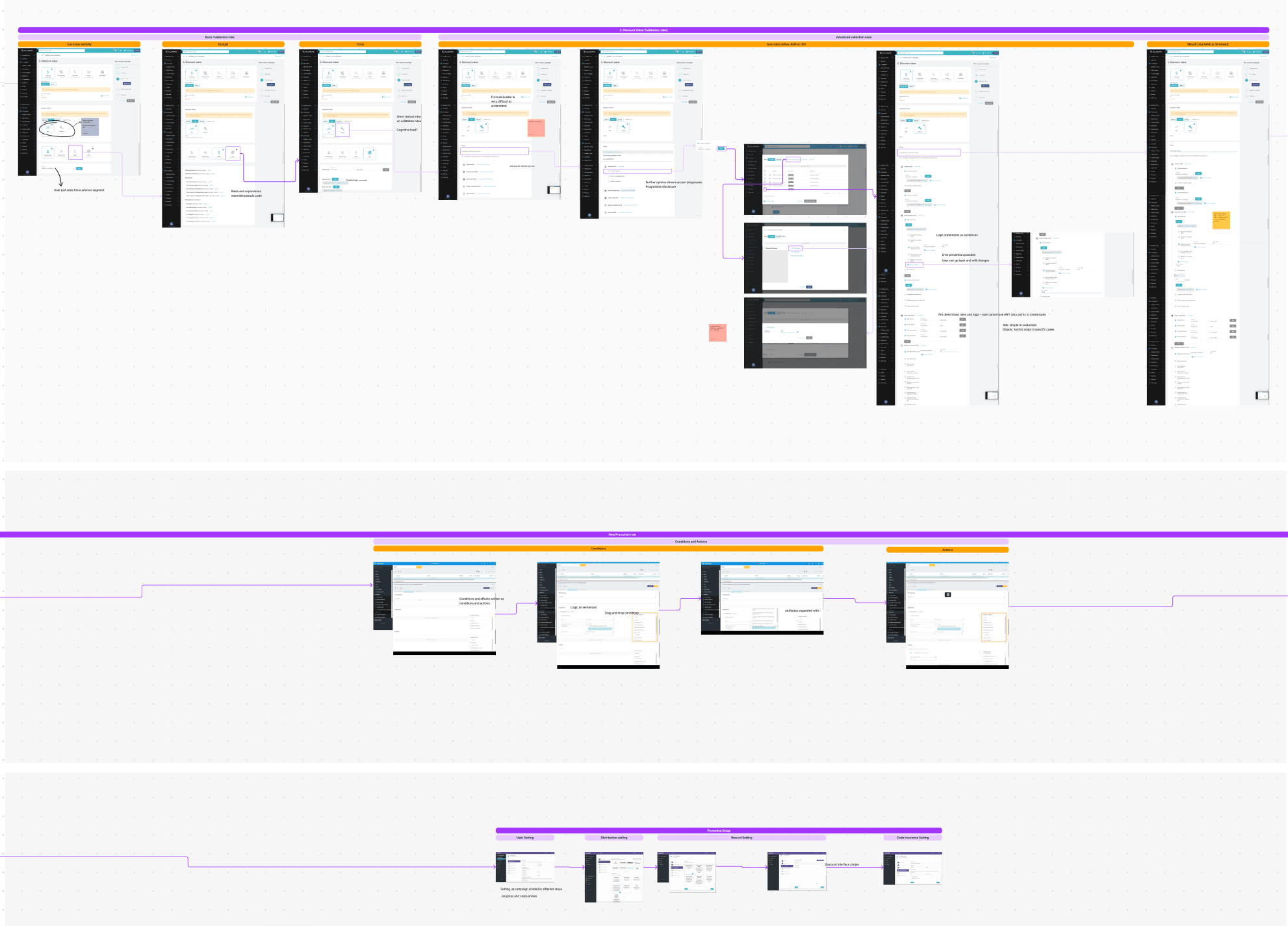
After a quick look at the feature and the platform, I used the 10 usability heuristics to list basic principles that might be undermining the rule builder’s usability. My primary sources, though, were customer reviews of Talon.One (particularly about the rule builder) and a review of competitors’ rule builders.*
*Only one competitor offered a cloud-based signup to explore the rule builder. The rest of the product screens came from competitor whitepapers and documentation.
Step 2: Gathering insights
What is happening?
After gathering user reviews of Talon.One and reviews of its main competitor, Voucherify, including the ones that directly mentioned the rule builder, I found that:
- – Users liked the clean interface, but found it difficult to understand what they were doing with the rule builder
- – Initial learning takes time, and users need a lot of support from the Talon.One team because there is very little description and documentation for the rule builder
- – Learning the vocabulary of the tool was challenging
Most of the feedback came from growth managers and system administrators. This was surprising, as even users with prior technical knowledge struggled to understand the tool at first. One system administrator said:
“…It isn’t obvious where the help tools are located, especially when struggling with the code logic.”
Why is it happening?
This can be due to:
- – The phrasing of attributes and logic statements differs across promotion engines
- – Users learn by recognition rather than recall, yet many Talon.One icons meant something completely different than elsewhere. For example, the hamburger icon was used for variables, not menus
- – Some of the disabled text in the rule builder was barely legible, causing more clutter than direction
- – The microcopy for the boolean logic was inconsistent
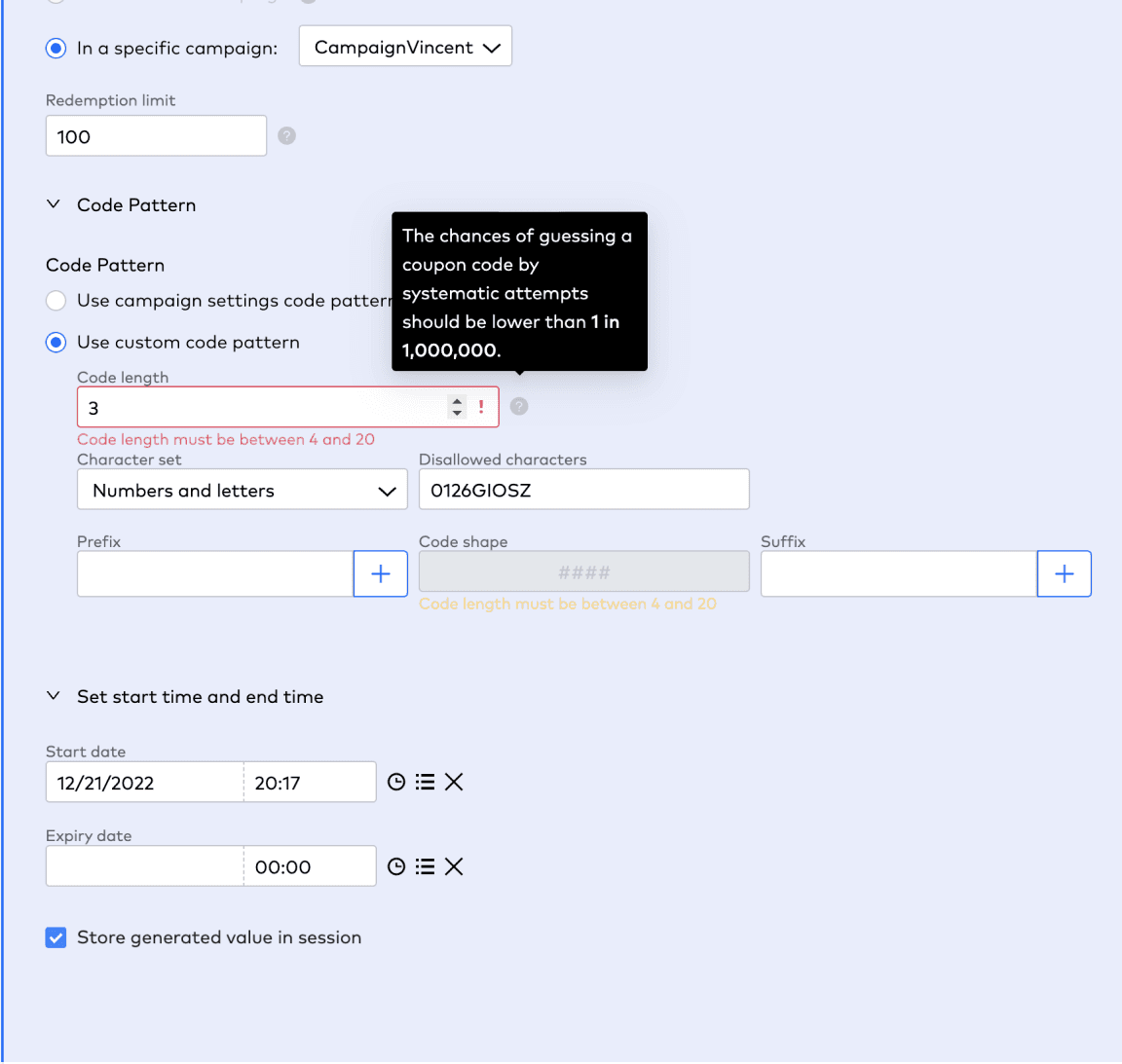
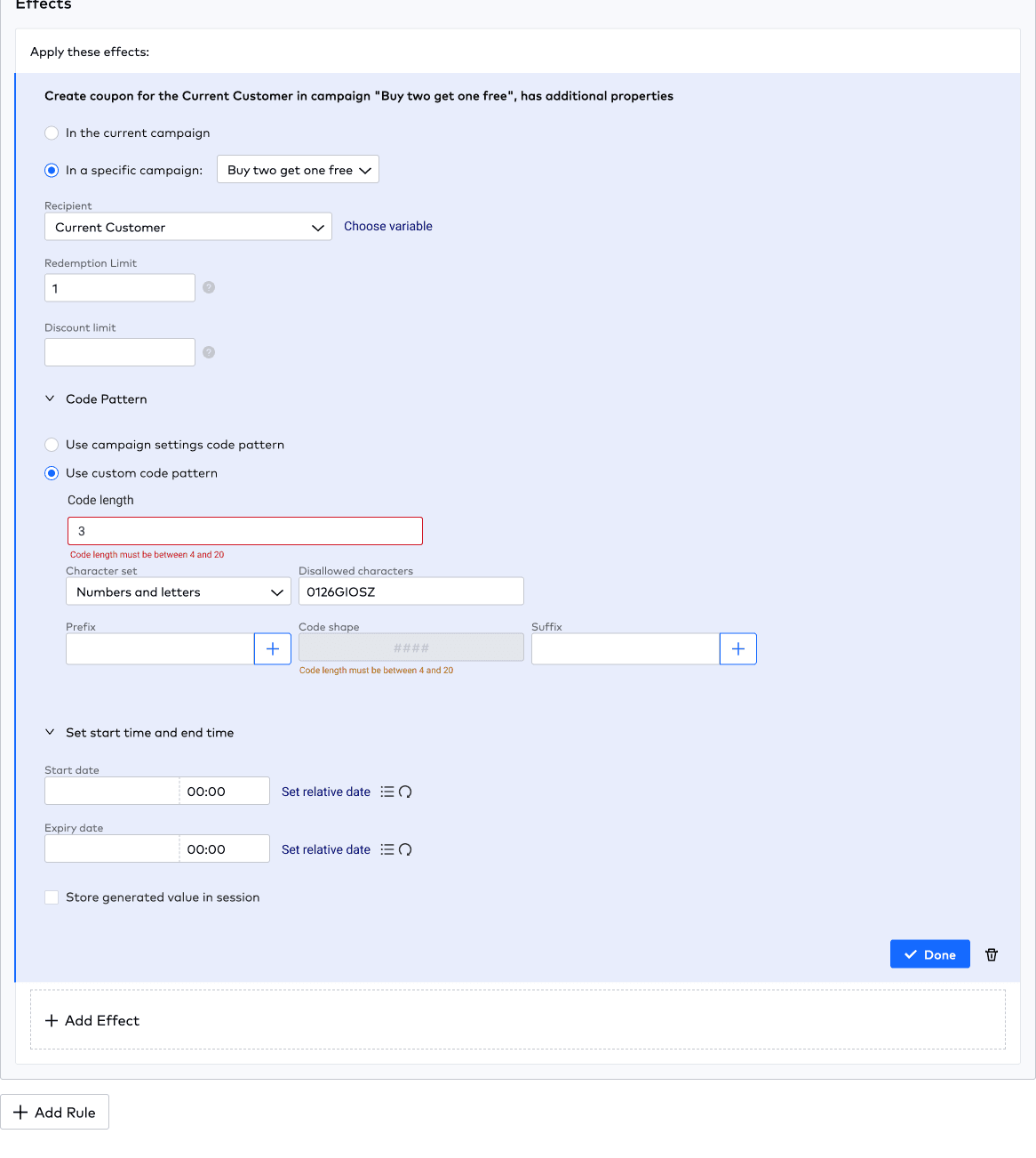
- – Warning statements were not well communicated
On the bright side…
Talon.One is one of a kind, with the utmost flexibility in its logic statements. After the initial learning phase, users report being able to set up granular and creative campaigns. A head of product said:
“Literally any data point can be used as the basis for a rule and therefore allows full creativity in promotion campaign design…”
The customer and competitor reviews also showed that:
- – Initial learning on these platforms is expected
- – Voucherify users had fewer complaints about field ambiguity
The absence of helpful cues, along with its own unique terminology and icon usage, could be making the platform harder to learn. The idea at this point was to suggest improvements while staying on brand. To understand the brand, I reviewed Talon.One’s website and Instagram feed to assess its brand traits. Based on this, I formed the customer opportunities below.
How might we…
- – Reduce the initial learning and setup time?
- – Make our terminology, fields and options understandable?
- – Highlight warning statements?
- – Make help and documentation accessible?
Step 3: Ideation
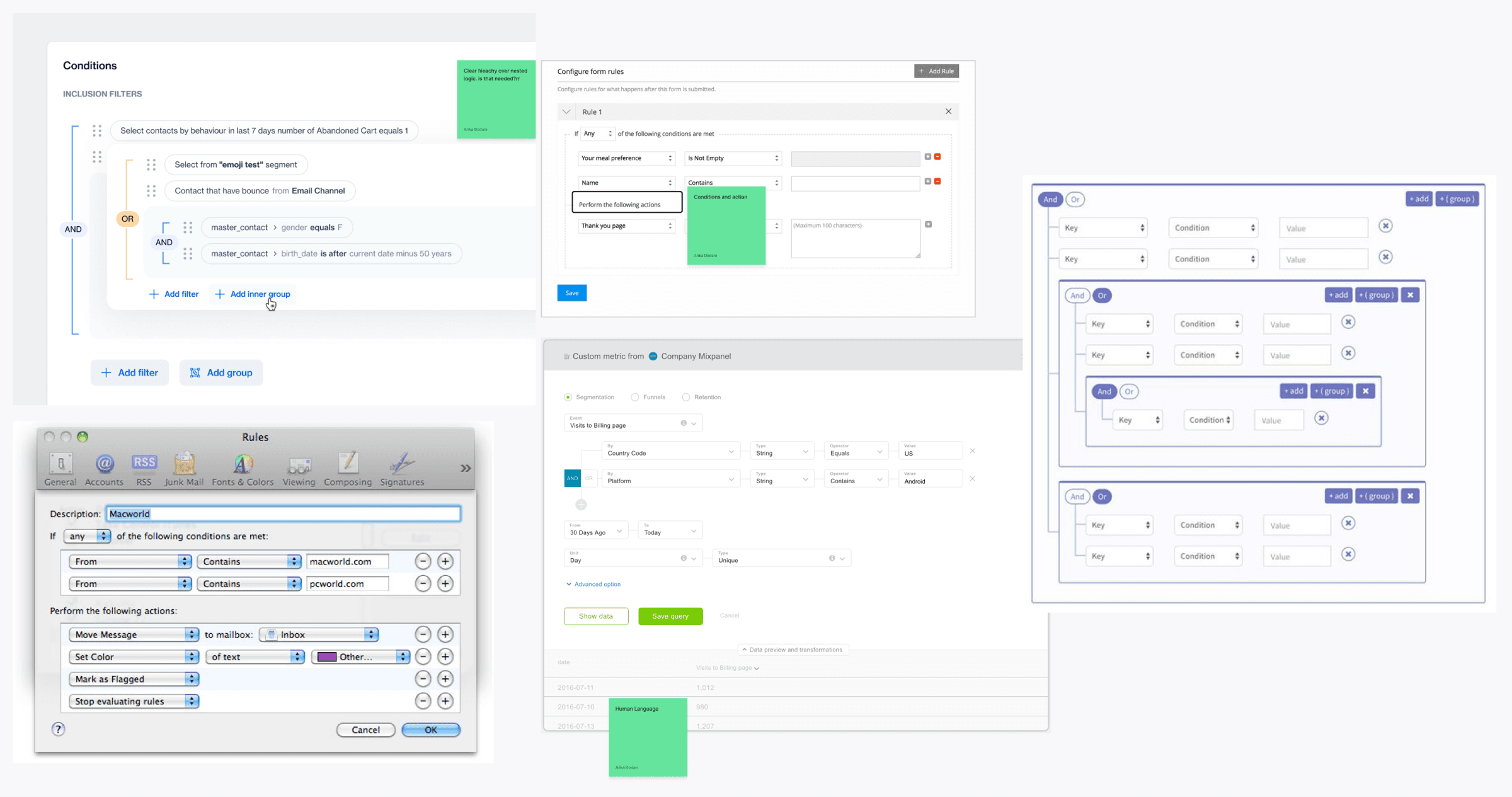
I started collecting and reviewing rule builders across platforms. Right away I noticed that nested logic was clearly distinguished, either by visual cues or proximity. Users could also drag logic sentences within a condition, and some rule builders clearly illustrated the affordance of moving a logic statement around.
This is also possible in the Talon.One rule builder, but I only discovered it by accident, as there was no signifier.
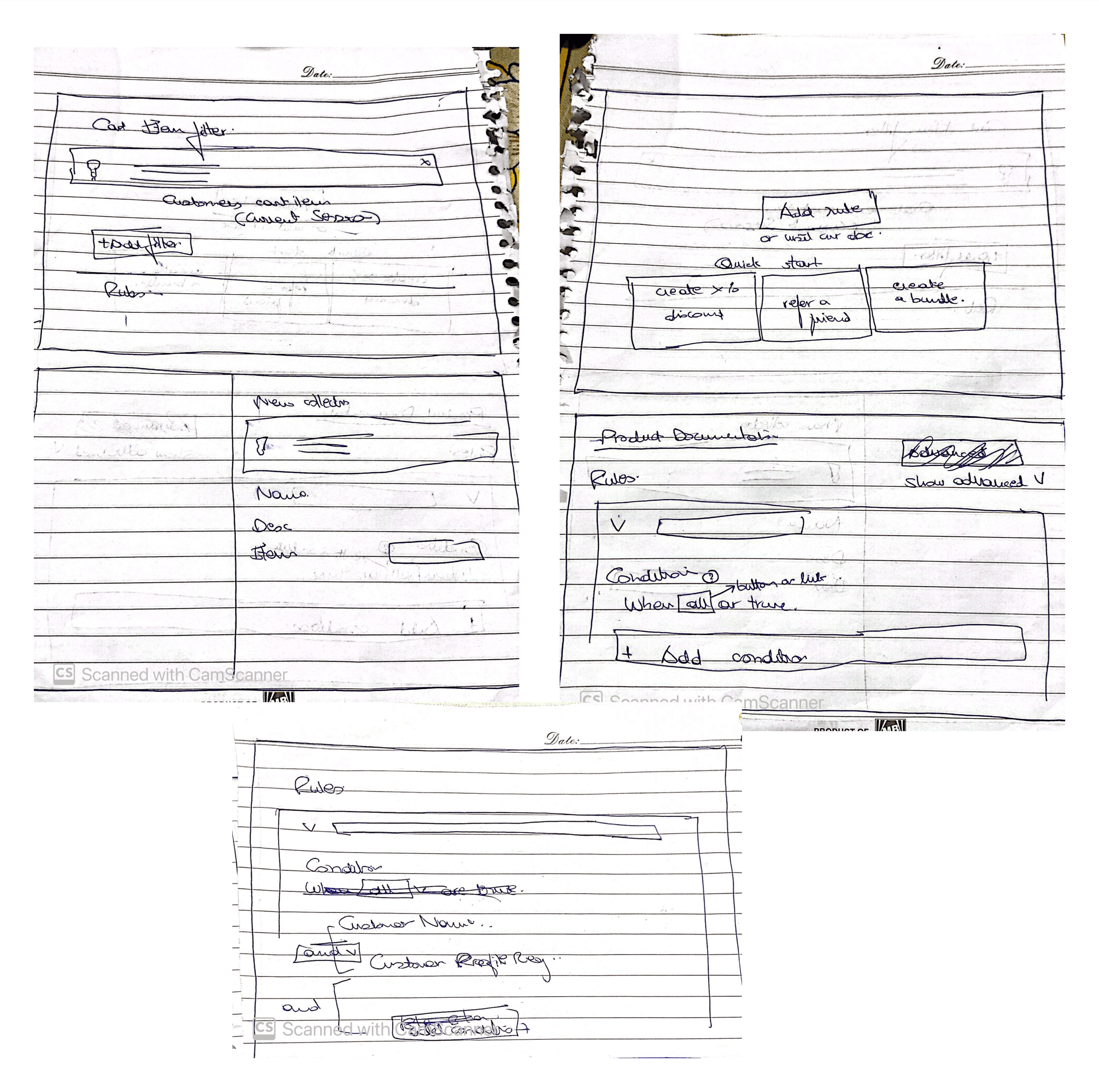
I drew some quick sketches to explore more dramatic interaction changes. At this point, though, starting slow and addressing UX changes that aid onboarding seemed like the rational way forward.
Step 4: UX changes
Design system
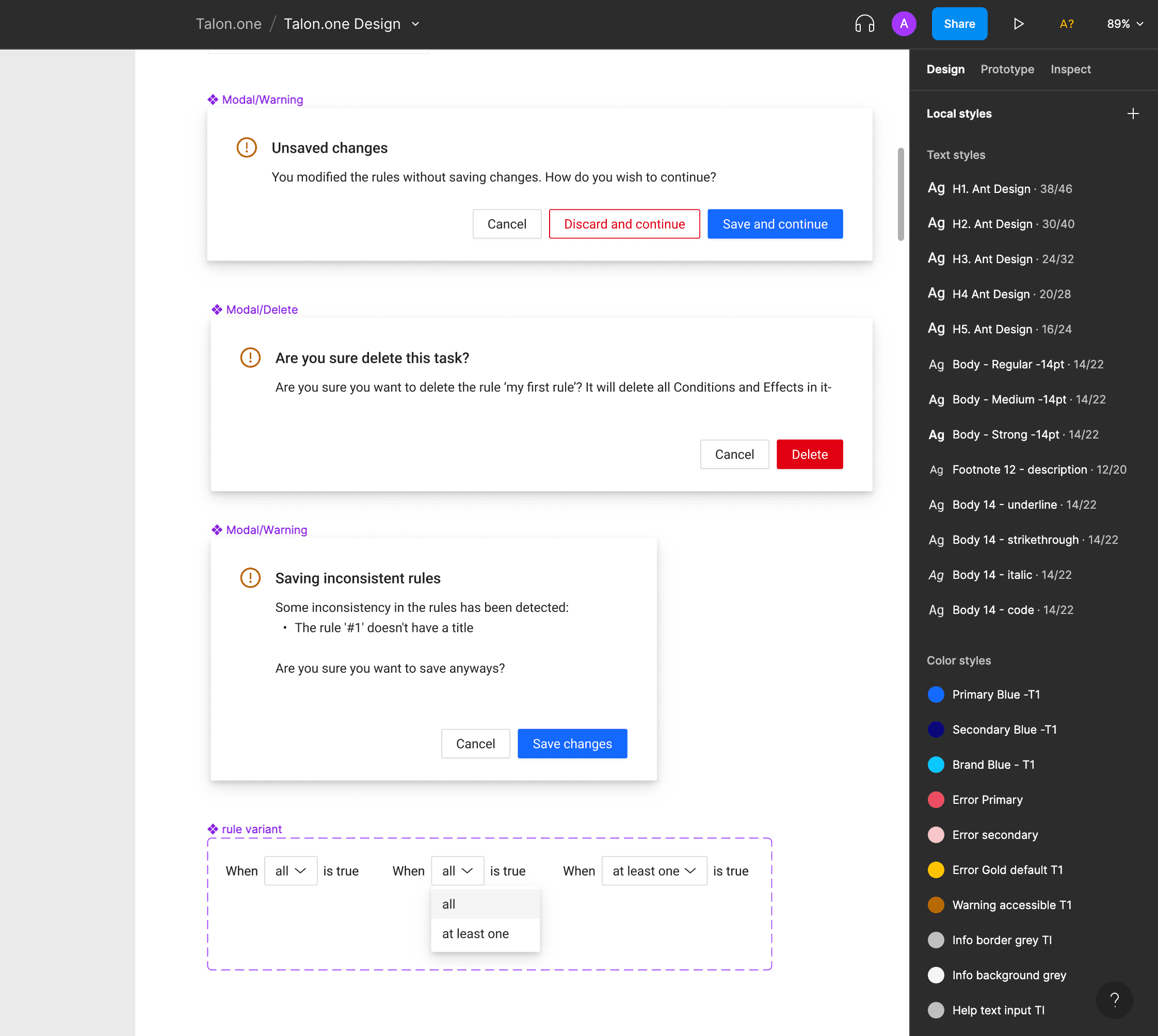
Talon.One uses a variation of the Ant Design system for its components. My UX changes called for some modifications to the pattern library, particularly the dialogue box.
UX/UI changes
The current layout is clean and has one action to guide the user, which is already a good design principle (Fitts’s law). However, competitors offer example templates of frequently used campaigns that users can look at and build on with minimal intervention. This can introduce familiarity.
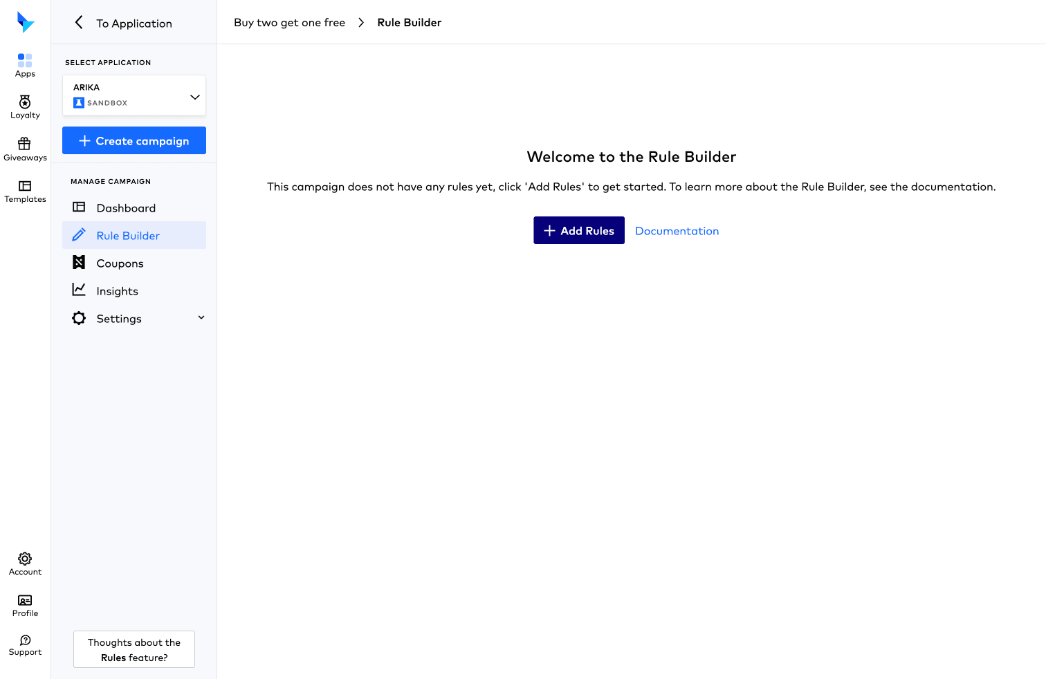
Depending on the most common campaign use cases, Talon.One could offer templates where users can observe which attributes are used to form which conditions and actions.
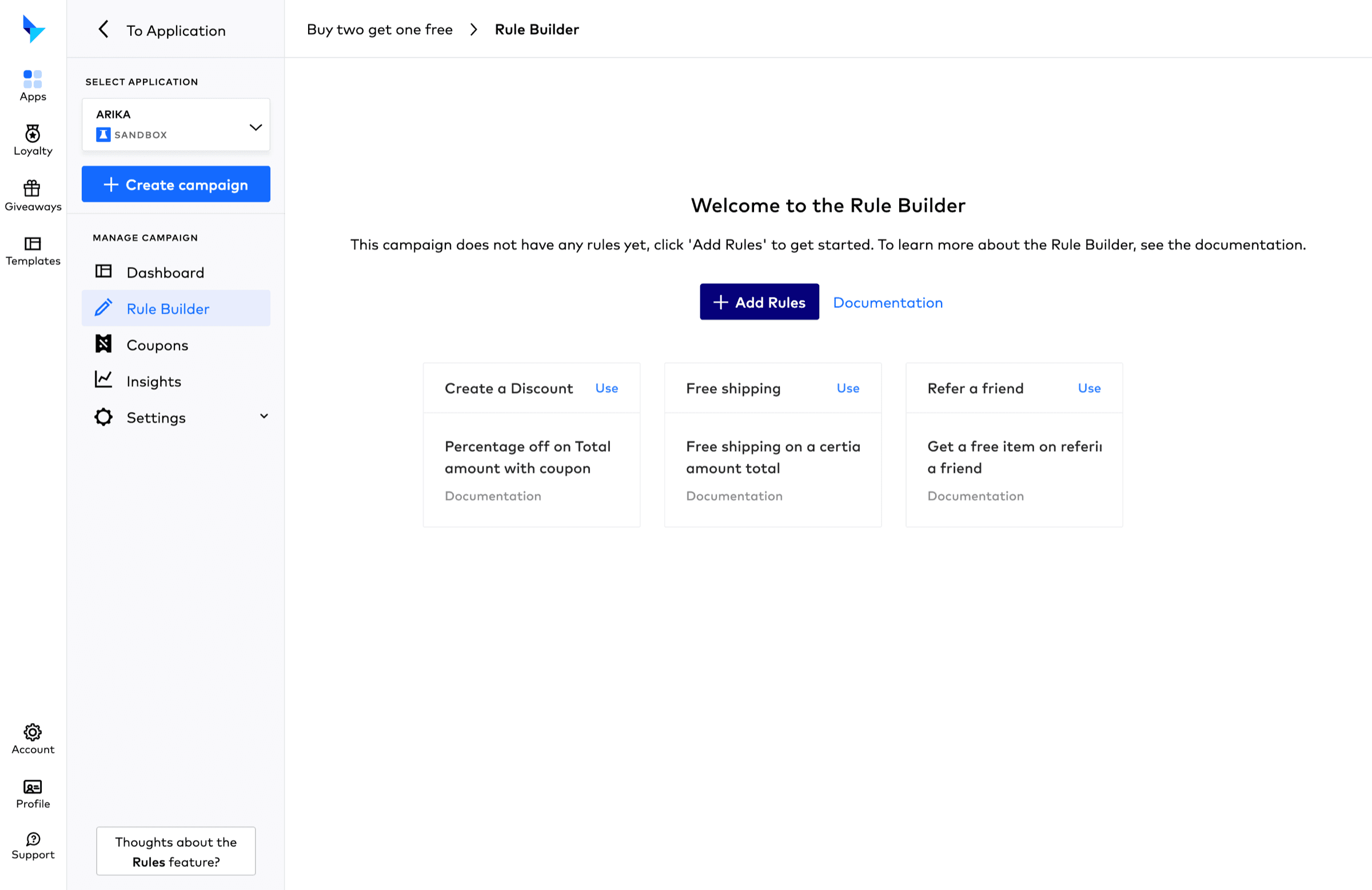
Some of the disabled attributes were difficult to read. The context on why they are disabled is only available on hover, and the language was passive and didn’t explain how to enable the attributes.
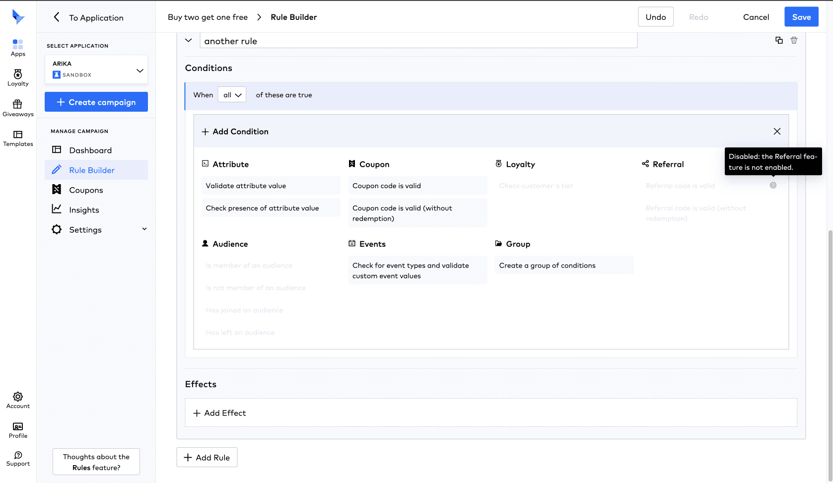
To make learning and onboarding smoother, I added the context above the attributes rather than on hover. The text points to actions users can take to enable those attributes, and the disabled text was made lighter for better visibility.
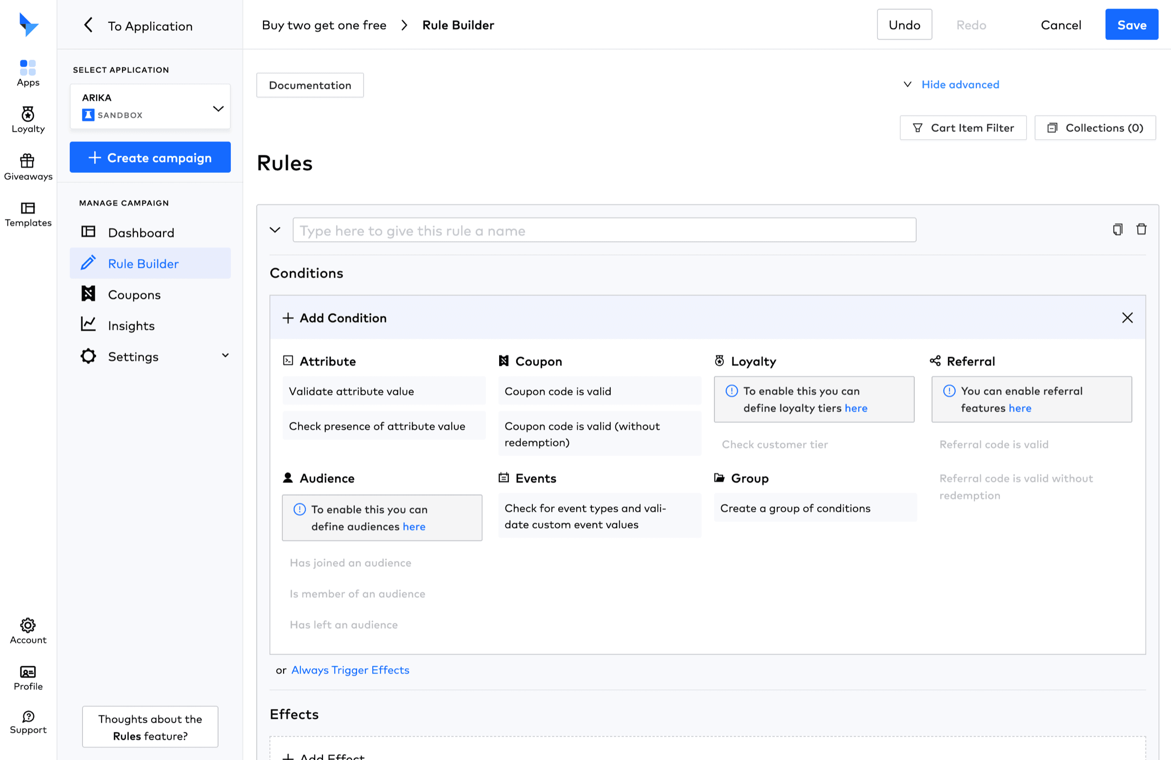
- – Documentation is in the bottom right under support. Given how many users flagged a lack of documentation, they may not have been able to find it.
- – Advanced functions in the top right may scare new users, while many competitors tuck further options away under ‘advanced’.
- – The delete icon colour is inconsistent (red and black).
- – Many icons mean something different in Talon.One than on other platforms, which can confuse users. For example, the hamburger icon, mostly used for menus, was used for adding variable text.
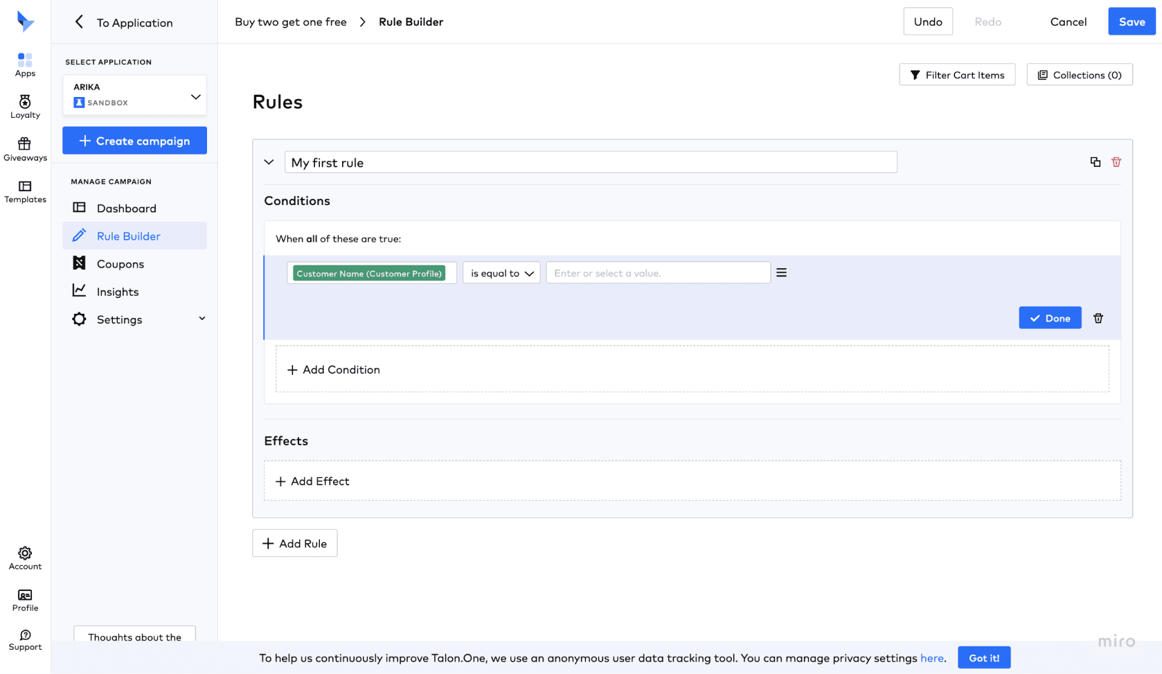
- – Functions that couldn’t be translated into icons are shown as links.
- – There is quick access to documentation in the top right.
- – The delete icon colour is consistent.
- – Advanced options are tucked away under ‘advanced’.
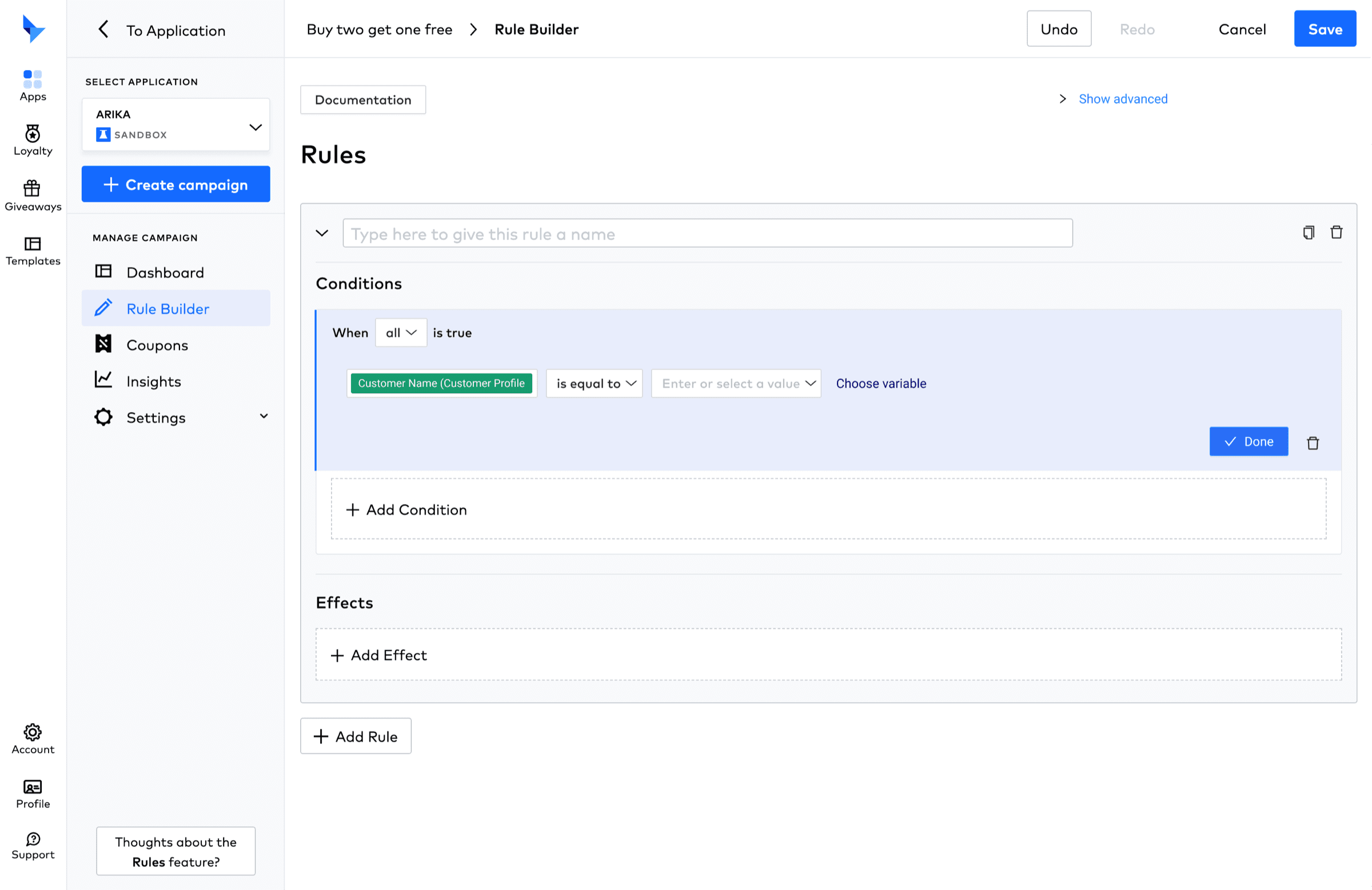
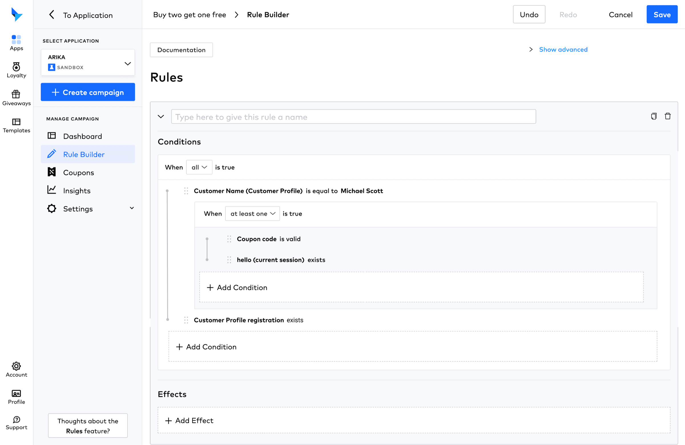
Nested logic is shown as a box within a box, but this could be more obvious. It’s also hard to know that logic statements can be dragged up and down.
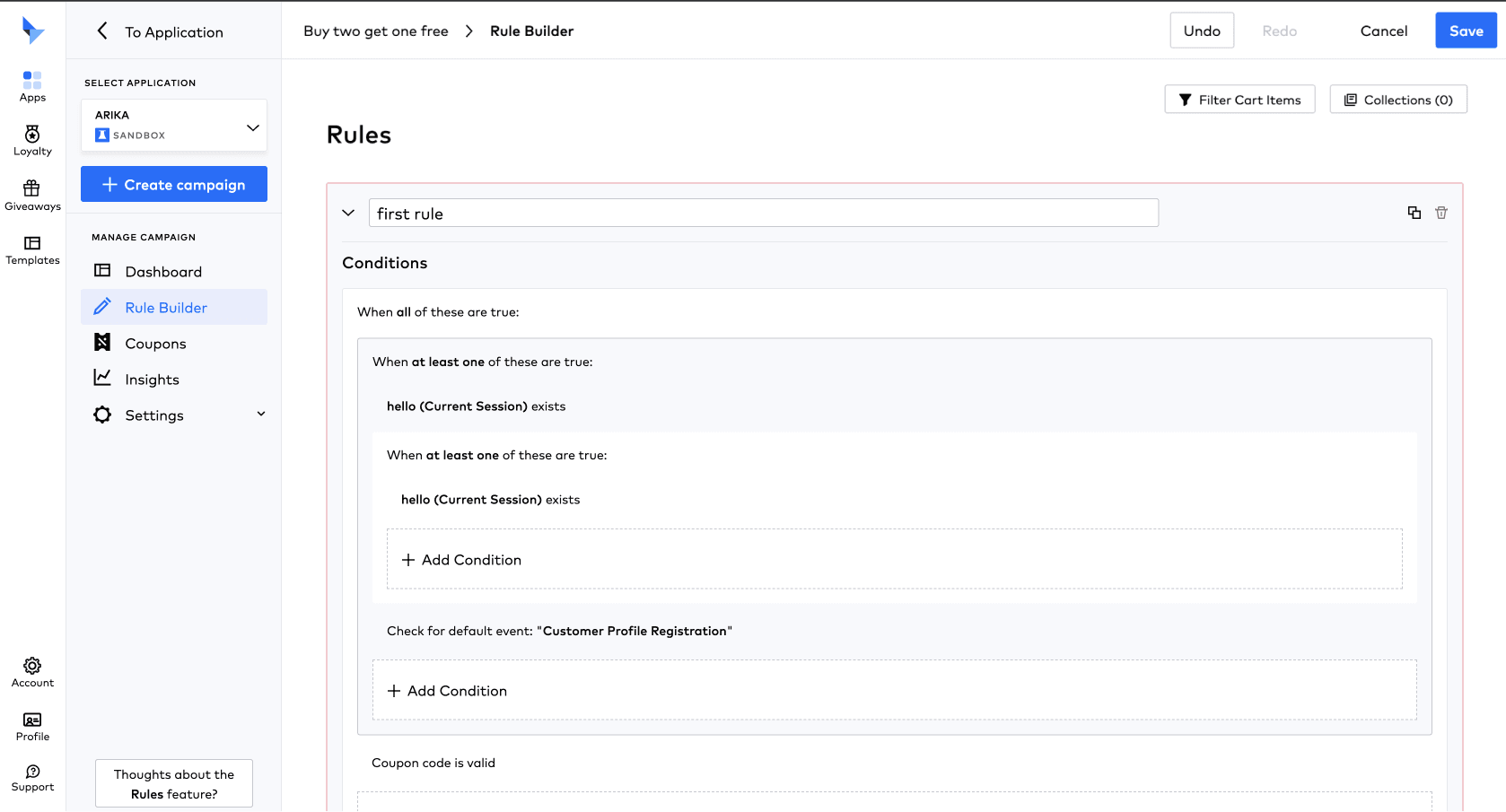
I added lines to show the nested logic and establish hierarchy, plus a signifier to show that statements can be dragged. The and/or dropdown was also made visible.
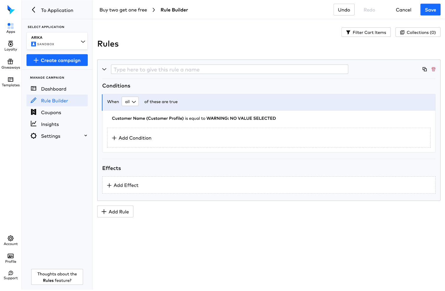
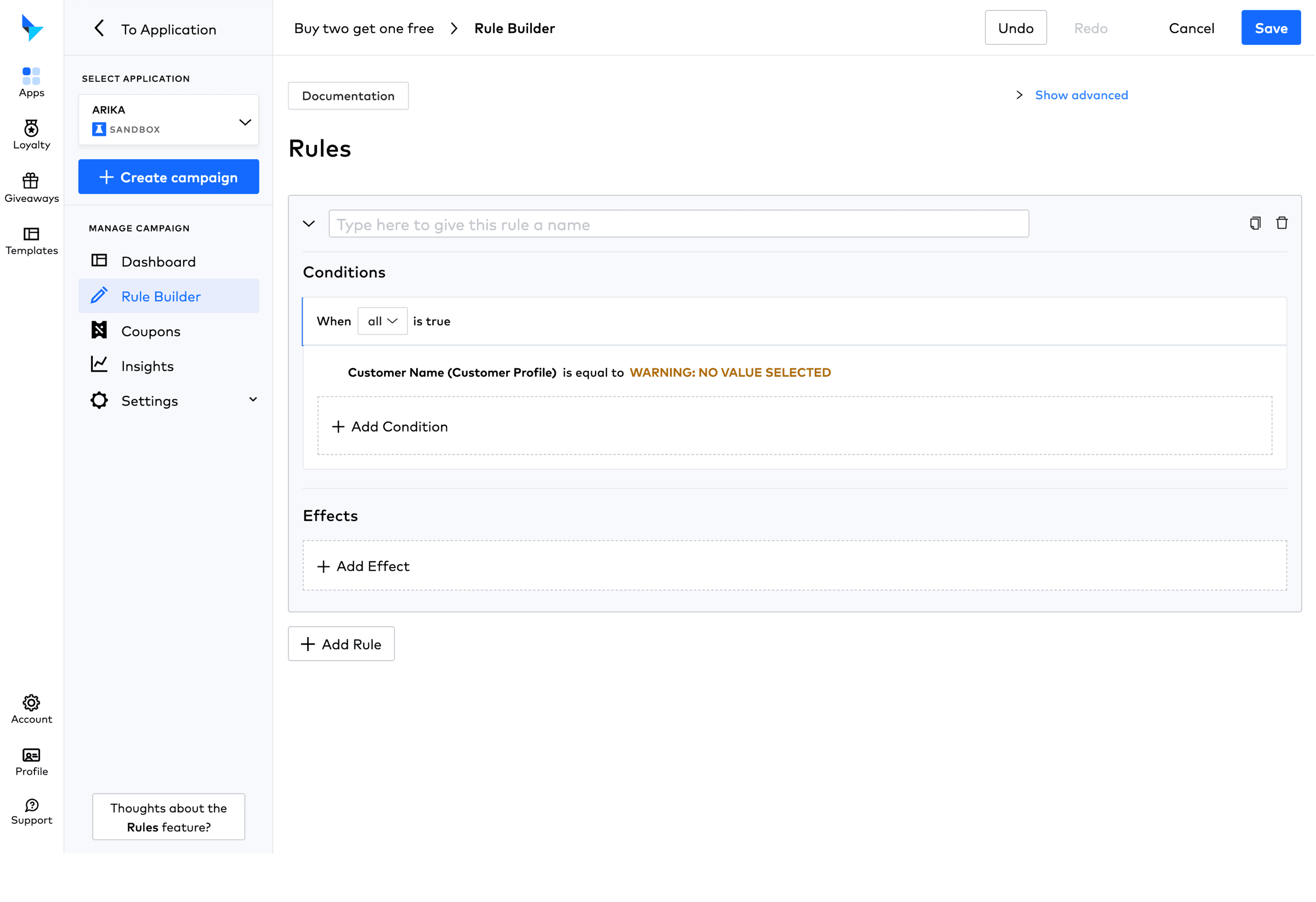
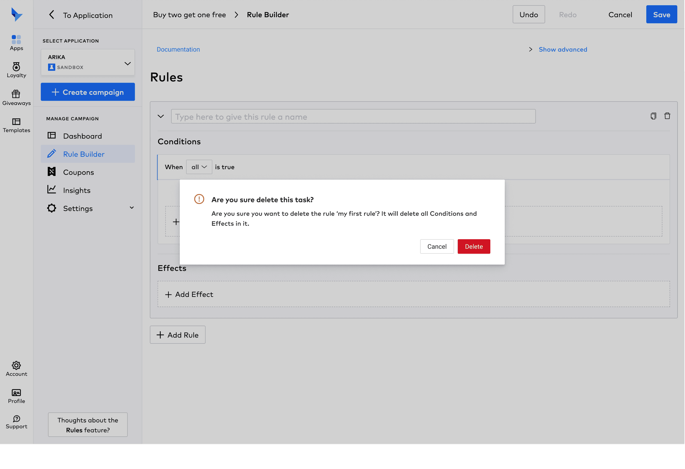
Warning statements blend into the logic statements, so there is no clear error prevention.
Warning statements are communicated clearly for error prevention.
The copy on some of the buttons in the dialogue box was long.
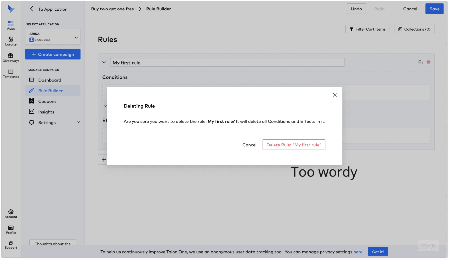
The type and the warning can be communicated in the header, keeping the button copy short.
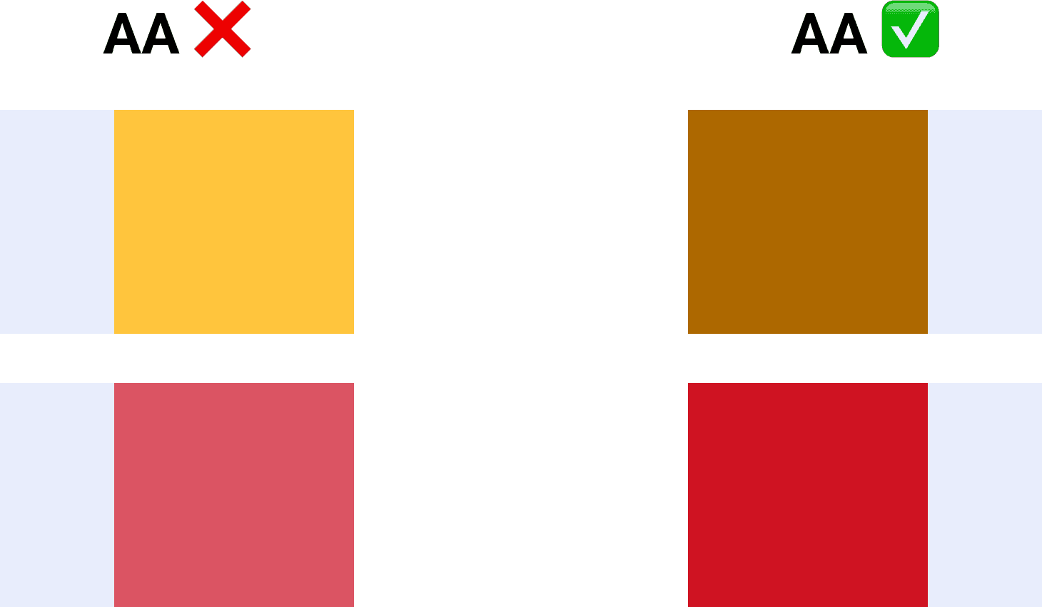
Accessible colour swaps
The warning and error colours didn’t pass WCAG AA contrast when placed on a light blue background.
As with the conditions, some icons were replaced with icons that more closely resemble their function, or with links.
Reflections
- – Customer reviews alone are not enough to show that the Talon.One rule builder is more complex than its competitors
- – Interviews and usability tests of the suggested tweaks would quickly prove or disprove the designs
- – While UX/UI plays an important part, the entire service design can help onboard new users
- – Most competitors seem to have a learning curve too, and users are expected to invest time in understanding the interface
- – More research could improve the interaction, as most of the focus here was on making documentation accessible and making the UI and microcopy consistent
- – User onboarding and progressive disclosure based on user behaviour could reduce learning time
Next steps
- – Test the designs with actual users
- – Focus on rule builder onboarding
- – Iterate on the rule builder after A/B testing and customer and stakeholder feedback